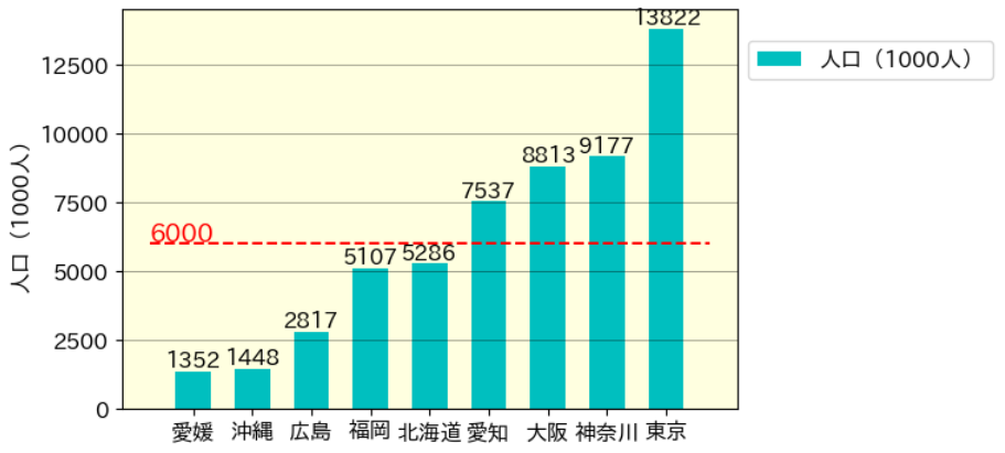
本記事では、下図のような縦棒グラフを作成する雛形コードを載せました。
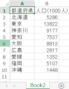
例題データは、下図のようなcsvファイルから、データをソート(並び替え)して上図を作成します。
■本プログラム
#!/usr/bin/env python
# coding: utf-8

# In[1]:


import pandas as pd
import numpy as np
import matplotlib.pyplot as plt
import matplotlib.ticker as ticker
import japanize_matplotlib
plt.rcParams['font.size'] = 12 # グラフの基本フォントサイズの設定

input_file = 'Book2.csv'
df = pd.read_csv(input_file, header=0, encoding="cp932") # 'utf-8' 'shift-jis' 'cp932'
df


# In[2]:


# データをソートする
x_name = '都道府県'
y_name = '人口(1000人)'
DF = df.sort_values([y_name], ascending=True)
DF


# In[3]:


# 縦棒グラフの作成
fig = plt.figure(dpi=100)

plt.bar(DF[x_name], DF[y_name], 0.6, color='c', label=y_name) # 'magenda'
for i, j in enumerate(np.array(DF[y_name])):
    print(i, j)
    plt.text(i, j, str(int(j)), ha='center', va='bottom', color='black')#, size=14)
plt.ylabel(y_name)

ax = plt.gca() # get current axes 現在の軸設定データを取得する
ax.set_facecolor('lightyellow') # 背景色の指定'
x_min, x_max = ax.get_xlim() # x軸座標の最小と最大を取得

# 基準値の挿入
y_spec = 6000
# 横線を入れる
plt.hlines(y_spec, x_min, x_max, 'r', linestyles='dashed')
# テキストを挿入する
plt.text(x_min, y_spec + 100, str(y_spec), size=14, color='r')

# y軸のラベル表記の間隔を指定
y_ticklabels = ax.get_yticklabels() # デフォルトの目盛り表記をゲットする
tick_spacing = 2500 # 目盛り表示する間隔
ax.yaxis.set_major_locator(ticker.MultipleLocator(tick_spacing)) # X軸目盛の表示間隔を間引く

# 凡例を表示
ax.legend(bbox_to_anchor=(1, 0.95)) # 凡例の位置

plt.grid(which="major", axis="y", color="black", alpha=0.5, linestyle="-", linewidth=0.5)
#plt.tight_layout()


# In[ ]:
以上
<広告>
リンク