'24/05/06更新:可読性向上のため、コードをクラスに書き換えました。
本記事では、データセットに対して、所望の関数にフィッティングして近似式を作成する雛形コードを載せました。scipyのoptimize.curve_fitを利用します。
▼比例近似:y = ax にしたい場合(切片0)

▼一次近似:y = ax + b にしたい場合

▼二次近似:y = ax^2 + bx + c にしたい場合

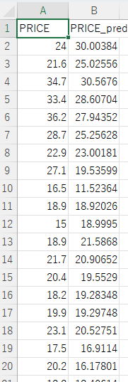
下図は、上図3つのサンプルデータの例です(csvファイル)。本プログラム内でpandasのDataFrame書式で読み込みます。そして、縦軸と横軸にする列名を指定すると、冒頭3つのような図を作成します。
■本プログラム
import pandas as pd
import numpy as np
import scipy as sp
from scipy import optimize
import math
import matplotlib
matplotlib.use('Agg')
import matplotlib.pyplot as plt
import datetime

class RegressionPlotter:
    def __init__(self, save_fname, X_name, Y_name):
        """
        RegressionPlotterクラスのコンストラクタ。

        Args:
            save_fname (str): 保存ファイル名のプレフィックス。
            X_name (str): X軸の列名。
            Y_name (str): Y軸の列名。
        """
        self.save_fname = save_fname
        self.X_name = X_name
        self.Y_name = Y_name

    def plot_regression(self, DF, approximation_function, label_format):
        """
        近似曲線をプロットするメソッド。

        Args:
            DF (pandas.DataFrame): データフレーム。
            approximation_function (function): 近似関数。
            label_format (str): 凡例のフォーマット。
        """
        popt, _ = optimize.curve_fit(approximation_function, DF[self.X_name], DF[self.Y_name])

        ax = plt.figure(num=0, dpi=120).gca()
        ax.set_title("pred vs real ", fontsize=14)
        ax.set_xlabel(self.X_name, fontsize=16)
        ax.set_ylabel(self.Y_name, fontsize=16)
        rp = ax.scatter(x=self.X_name, y=self.Y_name, data=DF, facecolors="none", edgecolors='black')

        x_min = DF[self.X_name].min()
        x_max = DF[self.X_name].max()
        y_min = DF[self.Y_name].min()
        y_max = DF[self.Y_name].max()
        x_min = min(x_min, y_min)
        x_max = min(x_max, y_max)

        x_range = x_max - x_min
        if x_max > 1:
            min_lim = 0
            max_lim = math.floor(x_max + 1) if x_range <= 10 else math.floor(x_max + 10)
        else:
            max_lim = 0
            max_lim = math.floor(x_max - 1) if x_range <= 100 else math.floor(x_max - 10)

        rp.axes.set_xlim(min_lim, max_lim)
        rp.axes.set_ylim(min_lim, max_lim)

        x_approximation = np.linspace(min_lim, max_lim, 10)
        y_approximation = approximation_function(x_approximation, *popt)
        line_approximation = ax.plot(x_approximation, y_approximation, linestyle='dashed', linewidth=3, color='r')

        rp.axes.set_aspect('equal', adjustable='box')
        plt.grid(True)
        ax.legend([line_approximation[0]], [label_format.format(*popt)], loc='upper left', numpoints=1, fontsize=15)
        plt.tick_params(labelsize=15)
        plt.tight_layout()
        plt.savefig(self.save_fname + '.png')
        plt.close()

class LinearRegression:
    @staticmethod
    def proportional_approximation(x, a):
        """
        比例近似関数 y = ax の定義。

        Args:
            x (float): x値。
            a (float): 近似パラメータ。

        Returns:
            float: 近似されたy値。
        """
        return a * x

    @staticmethod
    def first_order_approximation(x, a, b):
        """
        1次近似関数 y = ax + b の定義。

        Args:
            x (float): x値。
            a (float): 近似パラメータ。
            b (float): 近似パラメータ。

        Returns:
            float: 近似されたy値。
        """
        return a * x + b

    @staticmethod
    def quadratic_approximation(x, a, b, c):
        """
        2次近似関数 y = ax^2 + bx + c の定義。

        Args:
            x (float): x値。
            a (float): 近似パラメータ。
            b (float): 近似パラメータ。
            c (float): 近似パラメータ。

        Returns:
            float: 近似されたy値。
        """
        return a * pow(x, 2) + b * x + c

if __name__ == '__main__':
    # 日付の生成
    now = datetime.datetime.now().strftime("%y%m%d")

    # データセットの読み込み
    file_path = "sample_data.csv"
    df = pd.read_csv(file_path)

    # 比例近似プロッターのインスタンス化
    proportional_plotter = RegressionPlotter(now + "_01_PRICE_PRICE_pred_ProportionalApproximation", "PRICE", "PRICE_pred")
    # グラフ化
    proportional_plotter.plot_regression(df, LinearRegression.proportional_approximation, "y = {:.2f}x")

    # 一次近似プロッターのインスタンス化
    first_order_plotter = RegressionPlotter(now + "_02_PRICE_PRICE_pred_FirstOrderApproximation", "PRICE", "PRICE_pred")
    # グラフ化
    first_order_plotter.plot_regression(df, LinearRegression.first_order_approximation, "y = {0:.2f}x + {1:.2f}")

    # 二次近似プロッターのインスタンス化
    quadratic_plotter = RegressionPlotter(now + "_03_PRICE_PRICE_pred_QuadraticApproximation", "PRICE", "PRICE_pred")
    # グラフ化
    quadratic_plotter.plot_regression(df, LinearRegression.quadratic_approximation,
                                            "y = {0:.2f}x^2 + {1:.2f}x + {2:.2f}")

    print("finished")
▼手法は同じで、その他活用例として下記リンクを貼り付けます。
以上
<広告>
リンク
リンク
リンク