本記事では、Pycaretを用いて、スタッキング(Stacking)回帰モデルを構築する雛形コードを載せました。概要は下記です。
# スタッキング
stacked_model = stack_models(estimator_list = [reg], # 合成する回帰モデルをリストで指定。複数指定可
                             meta_model = best, # 土台となる回帰モデルを指定
                             choose_better = True,
                             optimize = 'MAE')
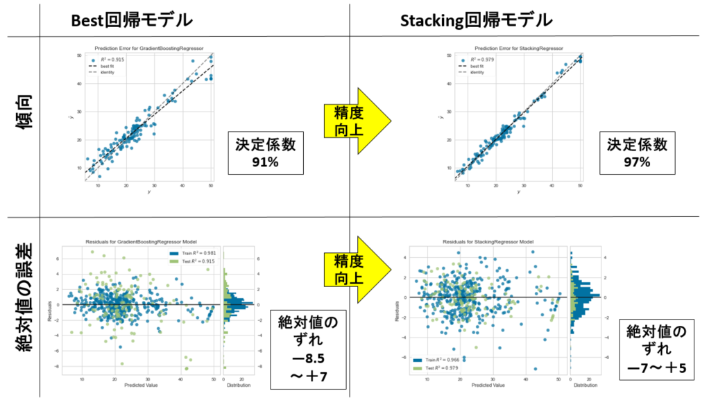
下図は、そのスタッキング回帰モデルの効果を示した図です。下図左は、Pycaretによるベスト回帰モデルの精度です。一方、下図右は、そのベスト回帰モデルとは別に線形回帰モデルを作成して、その2つを合成したスタッキング回帰モデルです。明らかに精度向上してる様子がわかります。つまり、未知の予測をしたい場合は、今回の場合、スタッキング回帰モデルが良いと判断できます。
■本プログラム
テストに用いたデータは、機械学習の回帰分析でお馴染みのボストンデータセットです。ググれば出てきます。
#!/usr/bin/env python
# coding: utf-8

# In[1]:


# データセットを読み込む
import os
import pandas as pd

file_path = './boston_dataset.csv'
df = pd.read_csv(file_path, # csvファイルをpandasのDataFrame型で読み込む
                 sep=',',
                 skiprows=0,
                 header=0,
                 encoding='utf-8')
display(df)


# In[2]:


# PyCaret用のデータセット生成(前処理)
from pycaret.regression import *
set_data = setup(data = df,
    normalize = False, # 標準化するかどうか
    #normalize_method = 'zscore', # 標準化'zscore' 正規化'minmax'
                                # 絶対値を1'maxabs' ロバスト'robust
    #ignore_features = ['ZN', 'CHAS', B'],
    train_size = 0.75, # 訓練データの割合
    session_id = 1, # ランダムシード
    target = 'PRICE', # 目的変数
    #categorical_features=['列名'], # カテゴリ型を指定する場合
    #numeric_features = ['列名'], # 数値型を指定する場合
    #remove_outliers = False, # 外れ値の除去
    #outliers_threshold = 0.05, # 0.05の場合、分布の両端裾の0.025%を除去
    #remove_multicollinearity = False, # マルチコ(多重共線性)除去
    #multicollinearity_threshold = 0.9, # 強い相関のある説明変数の片方を削除する
    #create_clusters = False, # クラスタリングにより新規特徴量を作成するかどうか
    #cluster_iter = 20, # default 20
    #polynomial_features = False, # 交互作用項を作成するか(新規特徴量)
    #trigonometry_features = False # 三角関数で作成するか
    #polynomial_degree = 2, # ↑次数で作成するか。[1, a, b, a^2, ab, b^2]
    #polynomial_threshold = 0.1, # 特徴量を残す判定しきい値
    #feature_interaction = False, # 交互作用(a * b)
    #feature_ratio = False, # 交互作用(a / b)
    #interaction_threshold = 0.01, # 特徴量を残す判定しきい値
    #pca = False, # 主成分分析による次元削減
    #pca_method = 'linear', # 'linear' 'kernel' 'incremental'
    #pca_components = 0.99, # 残す特徴量数。int型では数を指定。float型は割合
    silent=True, # 型チェックの手動確認のため一時ストップする場合はFalse
)


# In[3]:


# モデルを比較してトップ3のモデルを抽出
top3 = compare_models(n_select = 3,
                      sort = 'MAE', #default is 'R2' MAE, MSE, RMSE, R2, RMSLE, MAPE
                      verbose = False)


# In[4]:


# 各モデルのハイパーパラメータをデフォルト範囲で自動調整する
tuned_top3 = [tune_model(i, verbose = False) for i in top3]


# In[5]:


# ベスト回帰モデルを自動で選定する
best = automl(optimize = 'MAE')


# In[6]:


# モデルを評価する
predict_model(best)


# In[7]:


# 結果の可視化
plot_model(best, plot = 'error')


# In[8]:


# 残渣
plot_model(best, plot = 'residuals')


# In[9]:


# 線形回帰分析
reg = create_model('ridge') # lr, ridge


# In[10]:


# スタッキング
stacked_model = stack_models(estimator_list = [reg], # 合成する回帰モデルをリストで指定。複数指定可
                             meta_model = best, # 根幹となる回帰モデルを指定
                             choose_better = True,
                             optimize = 'MAE')


# In[11]:


# 合成した回帰モデルをファイナライズする
final_model = finalize_model(stacked_model)


# In[12]:


plot_model(estimator = final_model, plot = 'error')


# In[13]:


# 残渣
plot_model(final_model, plot = 'residuals')


# In[14]:


predict_model(final_model)


# In[15]:


# 回帰モデルを保存する
import datetime
now = datetime.datetime.now()
now = now.strftime("%y%m%d")
save_model(final_model, model_name = 'finale_model_' + now)


# In[16]:


# 保存した回帰モデルをロードする
load_reg_model = load_model('finale_model_' + now)


# In[17]:


# 新しいデータを読み込んで予測する(ここでは、便宜上、訓練データとテストデータを全部読み込む)
predict_df = predict_model(load_reg_model, data=df)
display(predict_df)


# In[18]:


# 適合度(相関性)をグラフで確認する。
import matplotlib.pyplot as plt
import numpy as np
from scipy import optimize
import math

### 近似式 y = ax 用の関数
def approximation_expression(x, a):
    return a * x

# 相関性の確認 横軸Y:縦軸Pred_Y
def plot_reg(DF, target_Yname, pred_Yname):
    Y = DF[target_Yname].values.tolist() # 生データをリストへ格納
    pred_Y = DF[pred_Yname].values.tolist() # 予測結果をリストへ格納

    # 近似式の作成
    popt, pcov = optimize.curve_fit(approximation_expression, Y, pred_Y)

    ax = plt.figure(num=0, dpi=120).gca()
    #plt.rcParams["axes.labelsize"] = 15
    ax.set_title("pred vs real ", fontsize=14)
    ax.set_xlabel(target_Yname, fontsize=14)
    ax.set_ylabel("Pred\n" + target_Yname, fontsize=14)
    rp = ax.scatter(x = target_Yname,
                    y = pred_Y,
                    data = DF,
                    facecolors="none",
                    edgecolors='black') # purple

    # 生データの最小値と最大値
    y_min = DF[target_Yname].min()
    y_max = DF[target_Yname].max()
    # 予測データの最小値と最大値
    y_pred_min = DF[pred_Yname].min()
    y_pred_max = DF[pred_Yname].max()
    # プロットするためのxデータの範囲を決める
    x_min = min(y_min, y_pred_min)
    x_max = max(y_max, y_pred_max)

    # グラフのレンジを決める
    x_range = x_max - x_min # データの範囲が100以下か以上かで分ける
    print("x_range = x_max - x_min = " + str(x_range))
    if x_max > 1:
        print("range A")
        min_lim = 0
        if x_range <= 10:
            max_lim = math.floor(x_max + 1)
        else:
            max_lim = math.floor(x_max + 10)
    elif x_max >= 0:
        print("range B")
        min_lim = -0.1
        max_lim = 1.1
    elif x_min >= -1:
        print("range C")
        min_lim = -1.1
        max_lim = 0.1
    else:
        print("range D")
        max_lim = 0.1
        if x_range <= 100:
            min_lim = math.floor(x_min - 1)
        else:
            min_lim = math.floor(x_min - 10)

    print(min_lim, max_lim)
    rp.axes.set_xlim(min_lim, max_lim)
    rp.axes.set_ylim(min_lim, max_lim)

    # 近似式プロットのためのデータを作成
    x_approximation = np.linspace(min_lim, max_lim, 10) # numpyでxデータを作成
    y_approximation = popt[0] * x_approximation # 近似式に代入してyデータを作成
    line_approximation = ax.plot(x_approximation, y_approximation,
                                 linestyle = 'dashed', linewidth = 3, color='r')

    rp.axes.set_aspect('equal', adjustable='box')
    plt.grid(True)
    # 凡例を指定して記入する場合は、リストで指定する
    ax.legend([line_approximation[0]], ["y = {:.3f}x".format(popt[0])],
               loc='upper left',
               numpoints=1,
               fontsize=14)
    plt.tick_params(labelsize=14)
    plt.tight_layout()
    plt.show()
    #plt.savefig(now + '_real_vs_pred.png')
    #plt.close()

plot_reg(predict_df, 'PRICE', 'Label')


# In[19]:


# 予測結果をファイルに保存する
predict_df.to_csv(now + '_predict.csv', index=False, encoding='utf-8')


# In[ ]:
以上
<広告>
リンク