本記事では、下図のような帯グラフ(積み重ね棒グラフ)の雛形コードを載せました。

次のサイトを参考にさせて頂き、前処理の追加や私好みに多少編集しています。matplotlib - 積み上げ棒グラフを作成する方法 - pystyle
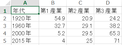
使用したデータは下図のようなcsvファイルを用いました。数値は、次のリンク先を引用しました。http://www.stat.go.jp/naruhodo/4_graph/shokyu/obi-graph.html
これをpandasでソートや正規化などの処理をしてから、冒頭のようなグラフにします。
■本プログラム
import pandas as pd
from matplotlib import pyplot as plt
import japanize_matplotlib
import matplotlib.cm as cm
df = pd.read_csv('産業別就業者数の構成率の推移.csv',
sep = ',',
encoding = 'cp932')
df
df.sort_index(ascending=False, inplace=True)
df
df.set_index('年代', inplace=True)
df
DF = df.div(df.sum(axis=1), axis=0)
DF
rows, cols = df.shape
print(rows, cols)
y_position_list = list(range(rows))
y_position_list
plt.rcParams['font.size'] = 14
fig, ax = plt.subplots()
x_offset = [0] * rows
x_offset
for i, my_col in enumerate(df.columns):
my_col_data = DF[my_col]
bar = ax.barh(
y = y_position_list,
width = my_col_data,
height = 0.8,
left = x_offset,
color = cm.hot(i/rows),
label = my_col
)
x_offset += my_col_data
for rect, val in zip(bar, my_col_data):
cx = rect.get_x() + rect.get_width() * 0.5
cy = rect.get_y() + rect.get_height() * 0.5
ax.text(cx, cy,
"{:.0%}".format(val),
color = 'white',
ha = 'center', va = 'center'
)
ax.set_xlim(0, 1)
ax.set_yticks(y_position_list)
ax.set_yticklabels(DF.index)
ax.legend(bbox_to_anchor=(1, 0.95))
以上
<広告>
リンク